After months of behind-the-scenes development, we’re excited to announce the launch of the new Formstack online form builder! It’s our biggest builder update in over four years, so it’s been a long time coming. To help you get acquainted, we’ve laid out all the details below.
Why?
Why did we decide to develop a new builder? Frankly, we felt it was time for a refresh. We wanted to give you an enhanced form building experience by making it faster and easier than ever to create powerful online forms. And we wanted to set ourselves up for future success by creating an environment where improvements can be rolled out faster.
How?
How did we go about revamping your builder? It’s been quite the process! We started by speaking to customers like you to discover recurring pain points with the existing builder. We then used information from those conversations to identify and develop builder improvements. To ensure the new builder is highly useful and intuitive, we preceded this public launch with a series of internal and beta launches to gather as much feedback as possible. We spread the builder updates across four internal launch phases, allowing employees to test one specific group of new features and functionality at a time. Once those four launch phases were complete, we ran through a full internal beta period. We then launched to a select group of beta customers. We used detailed feedback from every stage of the development process to improve the builder ahead of its official launch.
What?
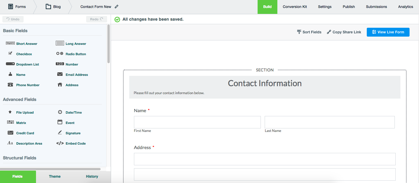
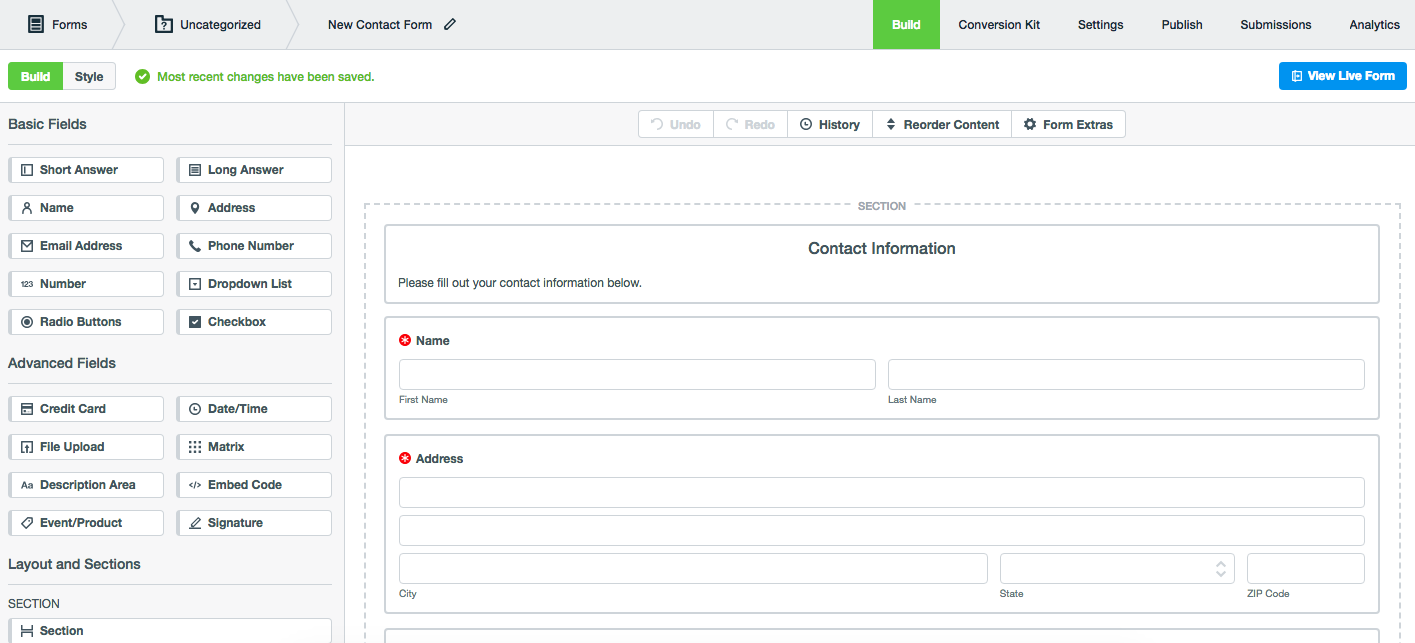
What’s new? The new builder has a cleaner look and some updated functionality, but the overall experience is still familiar. [caption id="attachment_27316" align="alignnone" width="700"]

Before[/caption][caption id="attachment_27317" align="alignnone" width="700"]

After[/caption]We detailed the updates in our new builder preview post, but here’s a quick rundown of the key changes:
- Navigation - We made the tools you need easier to find. The Build and Style tabs in the top left corner allow you to quickly switch between assembling and designing your form. The top toolbar provides easy access to undo/redo functionality, historical form data, and Form Extras.
- Drag and Drop - Dragging and dropping fields is now faster and smoother. Drop zones are highlighted in blue and expand when you hoer near them to make it easier to see where to drop a field.
- Form Fields - We redesigned and reordered the form fields portion of your builder and enhanced the functionality of some of the advanced fields.
- Conditional Logic - We made it easier to add logic to your forms, and we added visual cues (purple tags and highlights) so you can quickly see which fields and sections have logic applied to them.
- Themes - The new Themes Library is more organized and accessible and includes sort and search tools.
We also did an extensive rework of our codebase to make it easier to roll out future improvements.
When?
When will you get access to your new builder? All Formstack customers have been migrated to the new builder. Just login to your account to begin using it. We’re excited about the optimized Formstack form builder, and we hope you are too!
Not yet a Formstack customer but curious about the enhanced form builder? Now is the perfect time to explore our app. Click here to sign up for a free trial today.


